What's so good about Japanese packaging design?

If you have watched a lot of movies and TV shows about Japan, you must be deeply impressed by Japanese food, such as sushi, pork cutlet rice, ramen, etc. But as a designer, you also need to note that Japanese food packaging design, whether it is graphics, colors, fonts, or materials, has a very obvious Japanese charm.
calligraphy
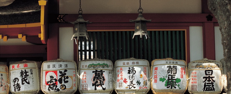
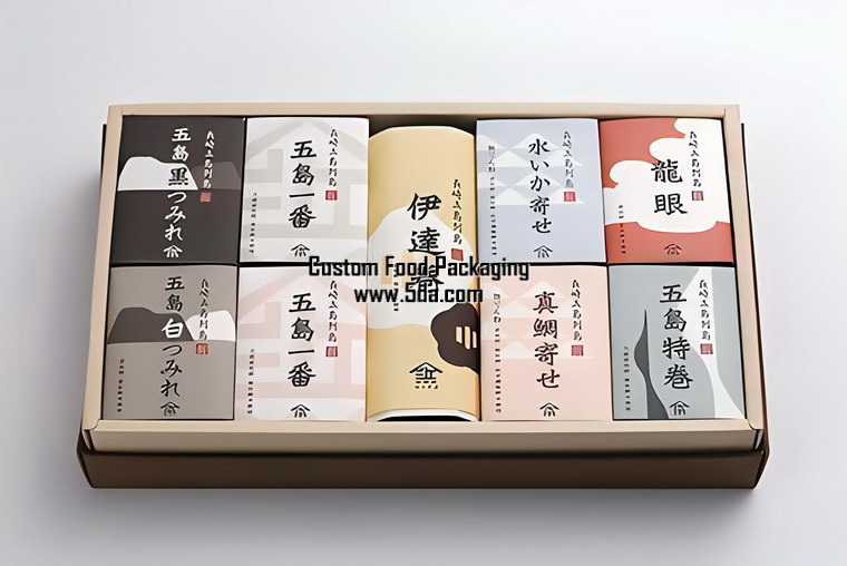
In fact, Japanese people like Chinese characters very much. So far, Japan's more than 200 era names are basically from ancient Chinese books. As the pinnacle of Chinese character art - calligraphy, the Japanese have also studied it very thoroughly, and have also formed a unique style of "calligraphy".Designers naturally integrated this new calligraphy into packaging design, and the visual effect presented is very elegant.
In addition, designers will also make bold ideas based on the origin and culture of the product and design fonts that can fully reflect the characteristics of the product. Such a design can not only express the information of the product, but also show consumers the cultural connotation contained in the product.
I have to mention Japanese sake here. The label names on the packaging are basically written in calligraphy. The picture below is the packaging design of the famous Japanese sake brand "Etsuno Hanmei". Under the light blue label, the calligraphy characters look more majestic and bold.

The packaging of the sake "Hakkaisan" in the picture below uses the calligraphy of modern calligrapher Mr. Kuyo Ishikawa, and is paired with text seal carvings related to Hakkaisan. By the way, the art director of this packaging is Kenya Hara, whom we are very familiar with.

There are many characters in Japanese, including kana, kanji and English. But precisely because of this, many creative permutations and combinations have appeared in Japanese packaging design.
typesetting
When Japanese kana and kanji typesetting appear at the same time, they can be arranged horizontally or vertically. When kana, Chinese characters and English appear at the same time, designers often arrange the Chinese characters and kana vertically and the English horizontally, so that consumers can see it clearly at a glance, and at the same time, the visual effect of the entire picture is more harmonious.The picture below shows the "Burning Tang Xinzi" fried chili rings produced by Asahi Group, which are snack foods. The designer is Kamura Koyo from the Japan Design Center. He used two bright colors of red and white to express the "spicy" character.

"Tang Xinzi", as you may have guessed, means chili pepper in Japanese. The designer first placed the word in the best visual area of the package, and the secondary explanatory text was arranged in the lower left position.

This kind of design can guide consumers' attention, and at the same time, it also uses the red background to highlight the text you want to explain, which has a strong visual impact.
Art
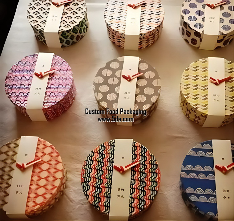
Japan highly values the craftsman culture and pursues excellence and meticulousness. Even in the rice-making industry, there is a "rice cooker immortal". In Japanese packaging design, even a card, a small pendant, or the folding of a box can make people feel the care.Confectionery is a traditional Japanese dessert, similar to biscuits and glutinous rice cakes. However, this most common snack, with the careful design and packaging of designers, has become a good souvenir in Japanese etiquette.

General-grade fruits will be packaged in three layers, with the outermost layer being wrapping paper, usually printed with Japanese comics, traditional patterns or text, and some will directly use traditional Japanese washi paper.
The second layer is the carton, with plastic compartments inside the box in which the fruits are neatly arranged. The layer of individual packaging is more elaborate, and some use hand-painted wrapping paper that has been painted with an anti-penetration coating.
Nature
The Japanese admire and revere nature. They believe that mountains, rivers, vegetation and trees all have souls, and they attach great importance to environmental protection and resource conservation. Many packaging designs also reflect this. For example, food packaging uses degradable and recycled paper, which does not destroy the flavor and is also very environmentally friendly.In addition to selecting natural materials as packaging design materials, designers will also use modern technology to create packaging with a natural feel.
The picture below is a "juice peel" drink box designed by Naoto Fukasawa. The packaging looks like the shells of bananas, strawberries and other fruits are directly used, making people feel the pure natural characteristics of the product.

In short, Japanese packaging design is very elegant, simple, and simple, which is also a reflection of traditional Japanese aesthetics.


 Japanese Food Packaging

